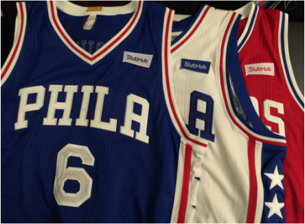
 StubHub paid $5 million for the right to have its patch displayed on the Sixers' uniforms. One positive: they can't look any worse. by Jack Kerwin | [email protected] The Sixers did it now. Going where no U.S. professional sports franchise has gone before, the bottom feeder of Philly’s paid-to-play operations has – on the eve of its most important of the year, when, for better or worse, it will be a prominent figure in the NBA Lottery selection – reached an agreement with StubHub on a deal that will feature a patch on the upper left portion of team uniforms that advertises the ticket-selling juggernaut. You know, just in case you need a reminder as to whom to bitch at for purchasing a ticket to a Sixers’ game in the first place … or thank for getting your mind off the Sam Bradford soap opera for a minute or two. Kidding aside, as other franchises follow a new money trail, this ultimately may prove to be the final line of demarcation, where teams and the cities they represent go from meaning so much to the fans who support both to meaning absolutely zilch. That loyalties eventually will be defined, purely and solely, by the most popular products and how much money they spend to get their names on the fronts and backs of jerseys. History and décor be damned. Not for nothing, but they’re both kinda important to me. Like to know not only what a team is about now, but how it got there. What success it has enjoyed. What failure it has endured. How it looked, too. Almost seems fitting with this arrangement, announced Monday morning, will have arguably the worst pro sports outfit of the last three years serve as the guinea pig … while decked out in the most nondescript attire available pretty much anywhere. You ain’t gonna find more boring and bland gear anywhere not only in the NBA, but the NHL, NFL and MLB as well. If we’re gonna talk blah, bland or flat-out “swing and a miss” style in this day and age’s branding wars, mostly fueled by the likes of Nike, Under Armour and Adidas, sportswear and footwear giants who serve as outfitters for so many teams at the pro and college levels, very few would present a legit challenge to the Sixers right now. Put it this way, it ain’t easy to mess up a red, white and blue color scheme in this country, even when aided by pretty decent logos that pay homage to U.S. history, but when screwed up to the fullest extent, the end result can be sheer drek. The Sixers have achieved that level before, hitting the awful apex from 1991 through 1994 with this home and away set. Not sure these totally uninspiring ones of today aren’t worse, though. On the other hand, not even a patch of advertisement makes a difference. Not with the Sixers at least. Elsewhere, where teams may succeed and look sharp in doing so, it'll likely be a different story – in the long run. | PHILLY THREADSIf we’re talking pro sports attire in town, and wearing a favorite jersey of one of your teams, you got some pretty good options here. OK, as “shared” to the left here, unless you got a craving to blend in with blah, you got three legit choices – the Eagles, Flyers and Phillies. But which franchise has the best? Here is one take: FLYERS OVERVIEW: Granted, my bias in favor of orange (especially teamed with black and white) as the primary in a color scheme, weighs heavy here. But my general malaise toward the club, its sport and genuine distaste for much of its fandom would seem to even the playing field here. Still, to me, their jerseys are the sharpest around. They haven’t worn black since 2010, which is a shame, but their two orange versions are sweet, especially the one with black shoulders, and the white is OK. TOP ONE: Orange with black shoulders. SUGGESTIONS: Bring back the black jerseys, and switch to more classic nameplates on the back. Current ones are, at times, awkward looking. PHILLIES OVERVIEW: They’re solid, real solid … and in most cities would rank No. 1. Classic red pinstripes at home and gray on the road, both with the Phillies script in red, outlined in white, and red caps with the Phillies P in white, along with creamish-white alternates topped by an alternate blue cap adorned with the Phillies P in red, with red bill. Haven’t noticed the red tops yet; probably a good thing. TOP ONE: Tough call, but the road grays with the red caps. SUGGESTIONS: Nothing really “wrong,” but an updating wouldn’t be a bad idea, and wouldn’t hate it if the alternate caps (and red tops) were scrapped. EAGLES OVERVIEW: Easily my favorite team of the three listed here, the Birds have great colors (midnight green, gray, white and black) and make good use of them. But the lettering and the numbering needs to change. Just looks awkward and cheesy at this point, almost forced. Helmet is solid. But it’s looked better before the redesign/rebrand two decades ago. TOP ONE: Actually a fan of the all-black uni with green helmet. The white-jersey, green-pant combo with the green helmet is sharp, too. SUGGESTIONS: Not a big proponent of the “bring Kelly green” back, but returning to some of the lines used in the old days would be an improvement. Oh, and ease up on the white-on-white uni crime. |
|
0 Comments
Leave a Reply. |
CategoriesArchives
November 2022
Best of 2018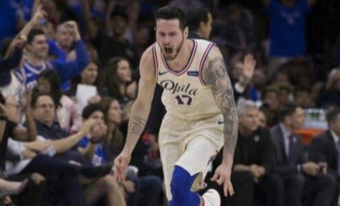
Best of 2017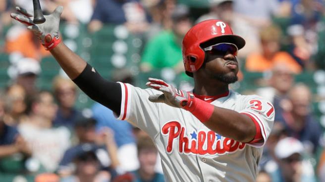
Best of 2016
Best of 2015
|
 RSS Feed